The Case for an Apple Watch without a Crown
When the Apple Watch was launched, a new interaction was introduced to new and existing users - the Crown. In use, it is similar the scroll wheel from the original iPod. However, that feature was deprecated as Apple started to move to touch interfaces on screen.
The Crown offers nostalgia to existing watch wearers but serves as a new interface which presents a learning curve which poses a small hiccup in usability - no matter how slight that learning curve may be. The Crown acts as the up/down scroll and zoom in/out function of the watch. The usage of the scrolling Crown is different than traditional touch gestures most users are familiar with.
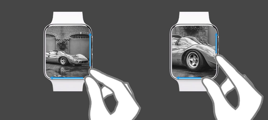
I propose utilizing the existing pinch to zoom gesture with the Apple Watch’s edge to remove the addition of the new Crown zoom/scrolling gesture. Utilizing the Apple Watch’s edge to zoom/in and out allows for maximum screen real estate so the user isn’t blocked from the subject in view. It also allows for the use of the familiar pinch-to-zoom gesture.
This is leveraging an existing interface on iOS where users pull from the top or bottom for notifications and utility short cuts.
The learning curve for this is much lower than Apple’s Crown and offers familiarity with it’s users.
