This Prototype is created with 3 breakpoints to communicate a responsive intent with Axure. The browser can be resized to communicate this intent.
Like most other UXers, I’m not a fan of carousels. Some research has shown that out of 3 million homepage visits, only 1% to 3% click a Carousel slide. In other words, they are not very effective if your stakeholders intend to display a second communication piece. So should you use a carousel?
Well the answer isn’t always no. If your stakeholders insist on a carousel, it is our job to create the best one that we can. There is a lot of advice out there in how to create the best one. It is a piece of prime real estate after all, being above the fold and all.
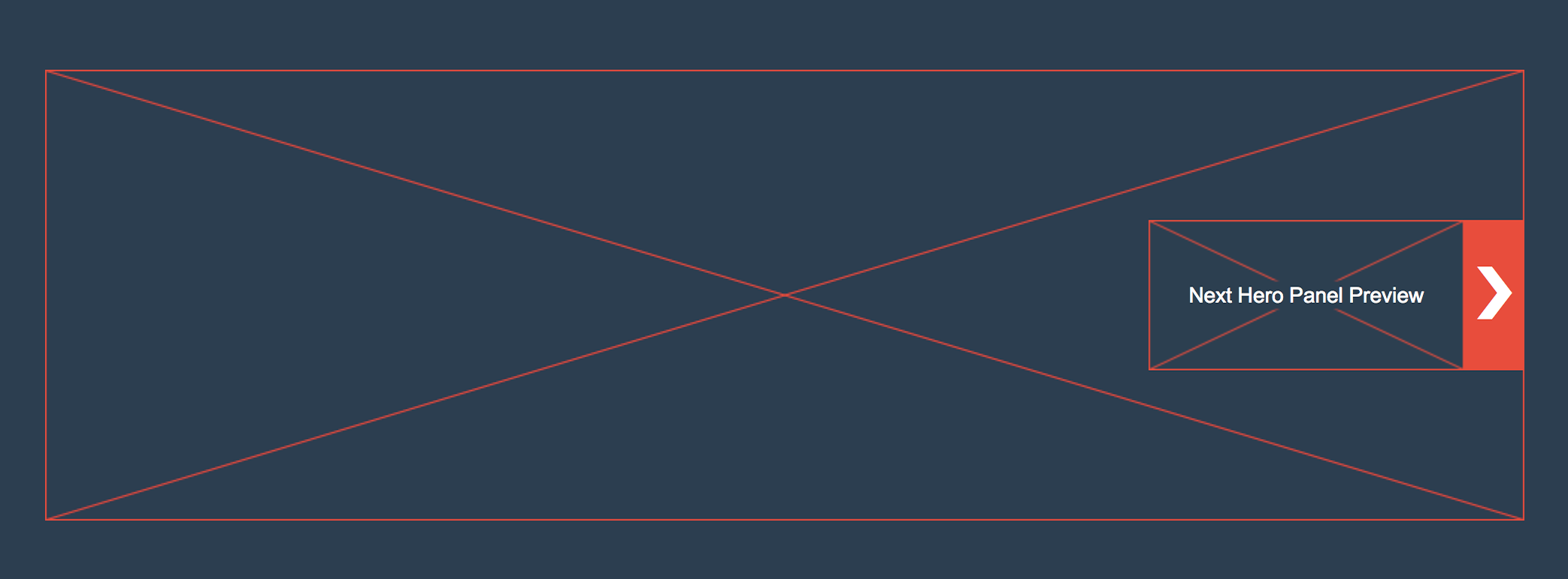
This carousel is an attempt at an example of creating better engagement with out users by peaking their interest and lowering that learning curve. On load, the carousel exposes the contents of the next slide to peak interest. Then it switches to a non-preview state and this action allows users to learn about this functionality without any action, just by observing.
In one of my previous projects with the MINI USA configurator, users did not know how to switch between Front, Rear and Interior view of the car when they were customizing their own MINI Cooper. By adding a sneak preview of the other angles of the car, we were able to increase clicks and engagement.
Again, carousels don’t always work but if we have to use one, try to create the best one. This is my attempt at a good carousel but of course, this prototype is only good pending notes from analytics, stakeholder interviews and user testing,